




Imagine a parent searching on their phone for the nearest urgent care while their child has a worsening fever. They need hours, directions, and a phone number immediately. If your site loads slowly, hides key information, or makes forms hard to use on a small screen, that parent may move on to another provider before your organization ever has a chance to help.
That kind of moment is increasingly common. More healthcare searches now happen on smartphones than on desktops, and patients expect healthcare websites to be fast, clear, and easy to use wherever they are. Whether you run healthcare marketing for a single-provider clinic or manage digital properties for a large hospital network, mobile optimization has moved from a nice-to-have to a baseline expectation. Here’s what it takes to get it right.
Why Mobile Matters So Much in Healthcare
Healthcare searches are often urgent, personal, and time sensitive. Someone looking for an urgent care clinic, a specialist’s office hours, or a prescription refill policy usually wants an answer immediately, not after scrolling through a clunky menu. A site that isn’t built for mobile adds stress to an experience that’s often already stressful.
Search engines have also adjusted their priorities accordingly. Google evaluates the mobile version of your site first when determining rankings, which means a poor mobile experience doesn’t just frustrate visitors, it can also hold your practice back in search results.
Common Mobile Pain Points for Healthcare Sites
Many healthcare websites were originally designed with desktop users in mind, and the mobile version was treated as an afterthought. That approach tends to create a handful of recurring problems:
- Contact information, hours, and locations are buried several taps deep instead of appearing right away
- Appointment request forms are difficult to complete on a small screen, with tiny fields or dropdown menus that misbehave
- Pages load slowly, especially those with large images of facilities or provider headshots
- Navigation menus require excessive scrolling or zooming to find the right service line or specialty
- Click-to-call buttons are missing, forcing patients to manually dial a number they must copy
Any one of these issues on its own might seem minor, but together they add up to a website that quietly pushes patients away.
What a Mobile-Optimized Healthcare Site Looks Like
A well-optimized mobile experience makes it easy for a patient to accomplish exactly what they came to do, whether that’s booking an appointment, finding directions, or learning about a condition. A few priorities tend to make the biggest difference:
- Fast load times, achieved by compressing images and minimizing unnecessary scripts
- Prominent, tappable click-to-call and click-to-map buttons near the top of every page
- Streamlined appointment and contact forms with large, easy-to-tap fields
- Simplified navigation that surfaces key service lines and providers without extra taps
- Text that’s legible without zooming, with enough contrast for patients of all ages
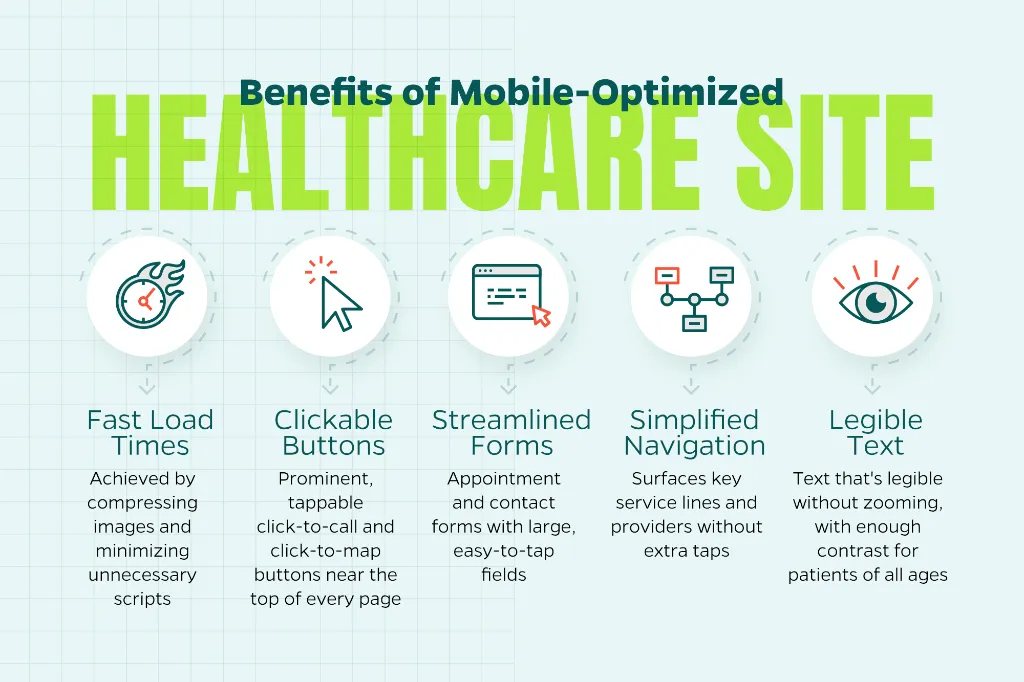
These aren’t cosmetic tweaks. They directly affect whether a patient completes an appointment request or abandons your site halfway through.
Accessibility and Mobile Go Hand in Hand
Healthcare audiences skew older on average than many other industries, and older patients are more likely to encounter friction with small text, low contrast, or clunky navigation. Building a mobile experience with accessibility in mind, larger touch targets, readable font sizes, and clear visual hierarchy, benefits every visitor, not just those using assistive technology.
This also matters for compliance. Many healthcare organizations already have accessibility standards in place for other patient-facing materials, and your website should meet that same bar.
Getting Started Without Overhauling Everything at Once
Start by testing your own site on a phone the way a patient would. Book an appointment, call the front desk, and find your address from a search engine result. The friction points usually reveal themselves quickly.
From there, prioritize fixes that touch the most-visited pages first, such as your homepage, contact page, and top service lines. Small, focused improvements can noticeably improve the patient experience while a longer-term mobile strategy takes shape.
Let Straight North Help
Mobile optimization is one of the fastest ways to improve how patients experience your healthcare organization online. If you’d like an expert look at how your site performs on mobile, contact Straight North today to talk through the possibilities.