

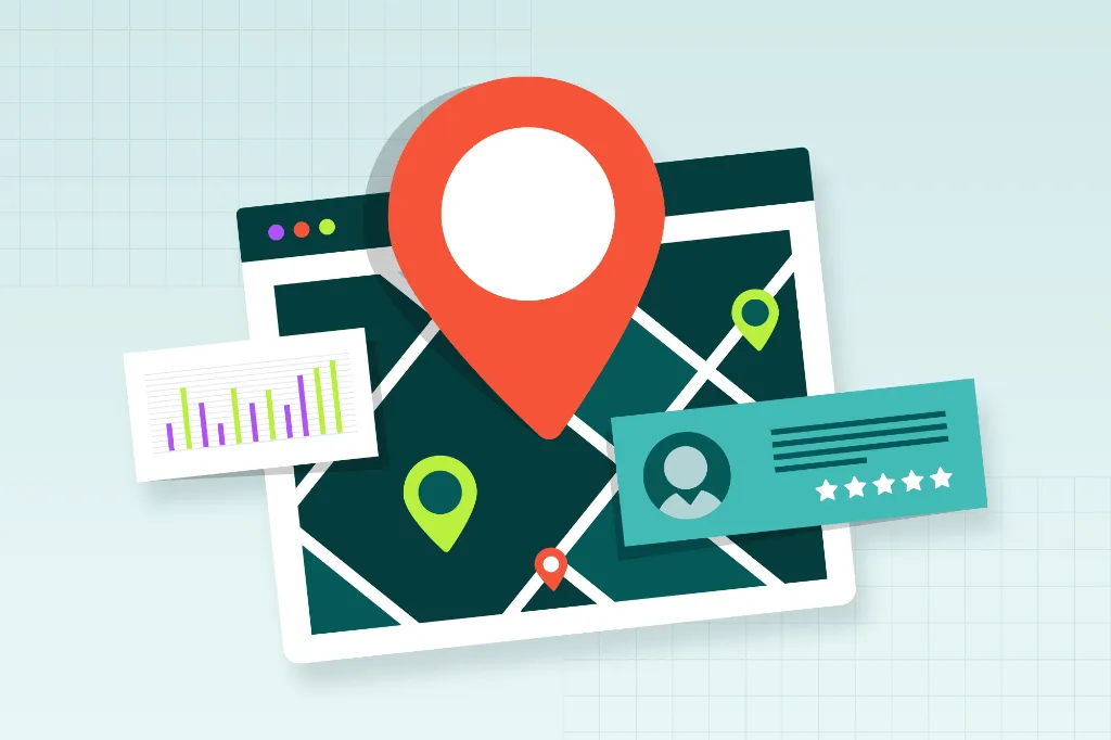
Website speed is a competitive advantage. Your visitors expect pages to load in the blink of an eye, and search engines are watching closely to reward sites that deliver. Yet, the biggest speed killers are often hiding in plain sight. Images.
Images tell your brand story, showcase your products, and drive conversions. But when they’re not optimized they also secretly sabotaging your performance. At Straight North, we see this all the time. The good news is that image optimization is one of the fastest wins you can get for improving both speed and user experience.
Why Image Optimization Matters
Images typically make up the bulk of your page’s total file size. When they’re large and uncompressed, they slow everything down, frustrate users, and can even hurt your search rankings.
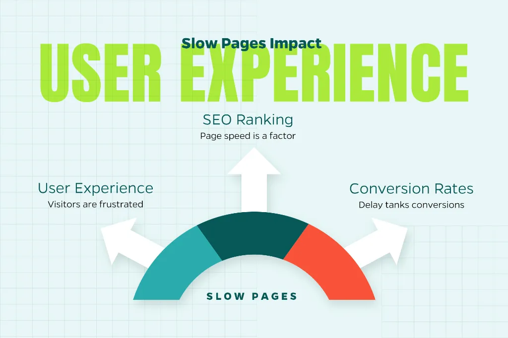
Here’s what’s at stake:
User experience: Slow pages send visitors running. Nobody’s got time to wait around.
SEO: Page speed is a ranking factor, especially on mobile devices where most of your traffic probably comes from.
Conversions: Studies show that even a one-second delay can tank conversion rates. That’s real money walking out the door.
The goal is to find that sweet spot where they look great without dragging down performance.
Start with the Right Image Format
Not all image formats are built the same. Picking the right one can slash file sizes without making your images look pixelated or washed out.
JPEG is your go-to for photographs and complex images with lots of colors. It compresses well and maintains decent quality.
PNG works best when you need transparency or razor-sharp edges—think logos and graphics. Just know that PNGs tend to be bigger than JPEGs.
WebP is the modern format that’s changing the game. WebP images can be 25-35% smaller than JPEGs or PNGs while looking just as good, and most browsers support it now.
SVG is perfect for icons, logos, and simple graphics. Since SVGs are vector-based, they scale beautifully to any size without getting blurry.
When you can, lean toward WebP or SVG. Your load times will thank you.
Resize Images Before You Upload Them
Here’s a mistake we see constantly: people upload massive 4000px-wide images to display in a 1200px container. Before you upload any image, resize it to match the maximum dimensions where it will appear on your site. And if you’re serving different layouts for desktop, tablet, and mobile, consider creating multiple sizes.
This simple step prevents browsers from working overtime to resize images on the fly.
Compress Without Losing Quality
Compression is where the magic happens. It strips out unnecessary data to shrink file sizes, but you’ve got to find the balance between small files and good-looking images.
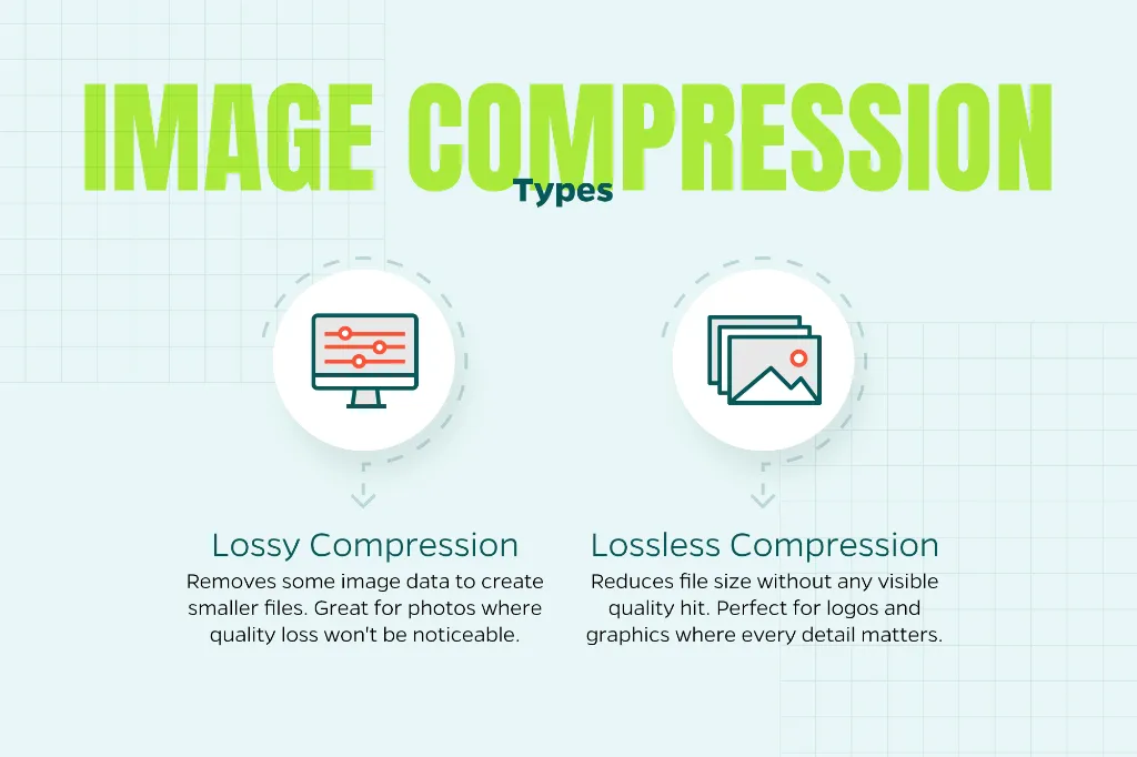
There are two types:
Lossy compression removes some image data to create smaller files. It’s great for photos where a tiny bit of quality loss won’t be noticeable.
Lossless compression reduces file size without any visible quality hit. Perfect for logos and graphics where every detail matters.
Most compression tools let you preview the results before you commit, so you can see exactly what you’re getting.
Use Responsive Images
Responsive images automatically adapt to different screen sizes and resolutions. That means mobile users on slower connections aren’t forced to download giant desktop-sized images they don’t need.
This is especially crucial for:
- Mobile users (which is probably most of your traffic)
- High-resolution displays that need sharper images to look crisp
Using responsive image techniques lets browsers pick the right version for each situation, improving both speed and visual quality.
Enable Lazy Loading
Lazy loading is one of those features that sounds too good to be true but actually delivers. It delays loading images until they’re about to enter the user’s viewport—basically, don’t load what people can’t see yet.
The benefits are real:
- Faster initial page loads
- Less data usage
- Better performance on image-heavy pages
This is a game-changer for blog posts, long-form content, and any page where images are scattered throughout.
Optimize Delivery with a CDN
A content delivery network (CDN) stores your images on servers around the globe and serves them from whichever location is closest to each visitor. Less distance means less latency and faster load times.
Many CDNs also come with built-in optimization features like automatic format conversion (serving WebP when browsers support it), on-the-fly resizing, and compression adjustments based on the user’s device and connection speed.
It’s like having a smart assistant that handles the technical heavy lifting for you.
Don’t Forget Image SEO
While speed is the main event, image optimization also supports your SEO efforts.
Here’s what to do:
- Use descriptive, keyword-relevant file names (not “IMG_1234.jpg”)
- Write clear, concise alt text that describes the image for accessibility and search engines
- Think about what someone might search for to find that image
Well-optimized images can show up in image search results and boost your overall page relevance. It’s a twofer.
Make It an Ongoing Process
Image optimization isn’t a “set-it-and-forget-it” thing. As your site grows and you add new content, you need to maintain consistent standards.
Consider:
- Creating internal guidelines so everyone on your team knows the sizing and format rules
- Auditing older content to find oversized or uncompressed images
- Monitoring site speed regularly to catch issues before they become problems
Small, consistent improvements compound over time into a noticeably faster, more competitive website.
The Bottom Line
Images should enhance your website, not hold it back. By choosing the right formats, resizing and compressing files properly, and delivering images intelligently, you can dramatically improve load times without sacrificing visual appeal.
Need help with this? Contact Straight North. We can help you take your digital marketing program to the next level.