




The calls to action (CTAs) in healthcare marketing carry a different weight than the ones you’d write for a retail brand or a software company. Patients aren’t just deciding whether to buy something. They’re deciding whether to trust a provider with their health and sometimes their most private concerns. A CTA that works in this space must acknowledge that reality.
Whether you’re marketing a single-location family practice or a multi-facility hospital system, the principles below can help your calls to action do their job: turning interested readers into scheduled patients.
Speak to the Decision, Not Just the Click
Generic CTAs like “Learn More” or “Click Here” ask for an action without explaining what that action means for the person taking it. Healthcare visitors respond better to language that names the outcome they’re seeking.
Consider the difference between these two approaches:
- “Submit” versus “Request Your Appointment”
- “Get Started” versus “Talk to a Care Coordinator Today”
- “Contact Us” versus “Schedule a Same-Week Consultation”
The second option in each pair tells the reader exactly what happens next. That clarity matters more in healthcare than almost any other industry, since visitors are often navigating a decision they’ve been putting off.
Reduce the Perceived Risk of Acting
Every CTA asks a visitor to give up something, even if it’s just five minutes of their time. In healthcare, the ask often feels bigger. It’s often about sharing symptoms, admitting a concern, or committing to a visit they’re anxious about. Your CTA copy and the microcopy around it can lower that barrier.
Here are a few ways to do this effectively:
- Add a short reassurance line beneath the button, such as “No obligation” or “Insurance accepted.”
- Offer a lower-commitment first step, like a callback request, alongside the primary scheduling CTA.
- Mention response time when you can back it up, such as “We respond within one business day.”
None of these require a redesign. They’re small additions that address the already-existent hesitation in a patient’s head.
Match the CTA to the Stage of Care
Not every page on your site should end with “Schedule Now.” A blog post explaining symptoms of a condition is serving a different reader than a page describing a specific procedure. Treating both the same way wastes an opportunity to move people forward at the pace they’re ready for.
Here is a simple framework to apply across your content:
- Awareness content (symptom guides, condition overviews): Invite readers to download a resource or take a self-assessment.
- Consideration content (treatment comparisons, provider bios): Invite readers to ask a question or request more information.
- Decision content (service pages, procedure pages): Invite readers to book an appointment or call directly.
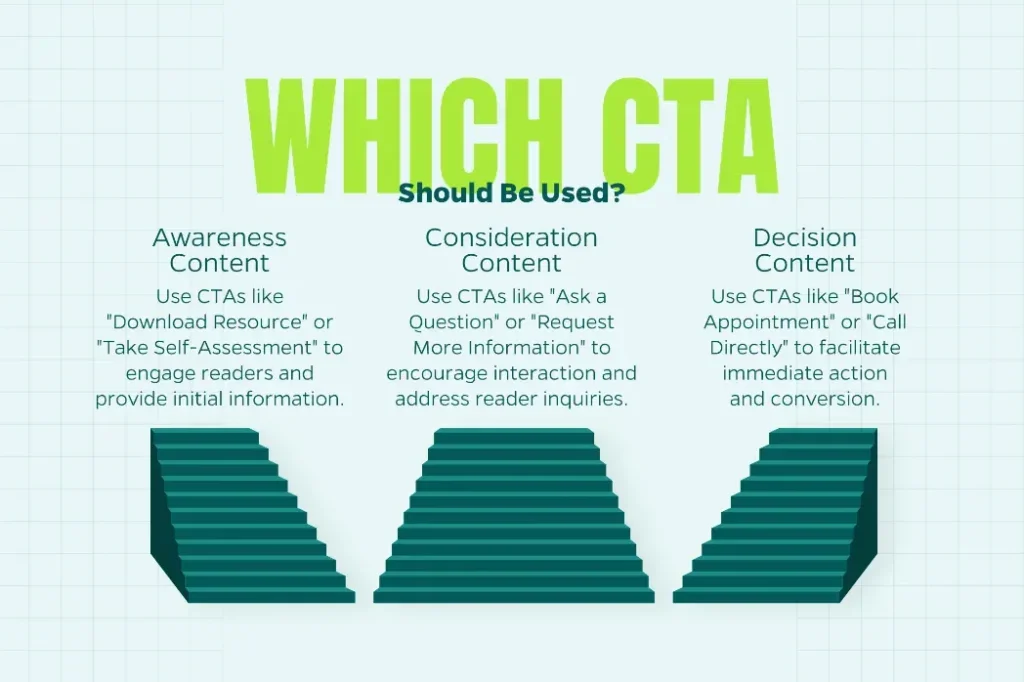
This staged approach respects where a patient is in their search, rather than assuming everyone who visits your site is ready to book today.
Design for Visibility
Even a well-written CTA underperforms if it’s buried below a wall of text or styled to blend into the page. Healthcare sites tend to be text-heavy, since providers want to be thorough about conditions and treatments. That thoroughness can bury the one line that matters most.
Keep these placement habits in mind:
- Put a CTA above the fold, then repeat it at the end of longer pages.
- Use a button, not a text link, for your primary action.
- Make phone numbers clickable on mobile so patients can call without copying a number.
A CTA is only as strong as its ability to be seen and used in the moment a reader decides to act.
Test Before You Assume
What works for a dermatology practice may fall flat for an urgent care clinic or a hospital network. Patient expectations shift depending on specialty, urgency, and even the age of the audience you’re serving. Rather than guessing, run small tests. Swap button copy, adjust placement, or try a secondary CTA on high-traffic pages, then track which version drives more scheduled visits.
Over time, these tests build a picture of what your specific patients respond to, which is far more useful than borrowing a template from an unrelated industry.
Conclusion
A strong healthcare CTA does more than prompt a click. It reduces hesitation, matches the reader’s stage of care, and makes the next step feel like a natural continuation of what they just read, not a hard sell. Clinics and large institutions alike can apply these same principles and achieve significant results; only the scale of testing and the resources behind it tend to differ.
Need Help?
If your website’s calls to action aren’t converting visitors into patients, Straight North can help you diagnose why and build a strategy to fix it. Contact us today to learn more.