


A manufacturer’s website often determines whether a buyer calls, requests a quote, or moves on to another supplier. As a result, clear UX builds trust. It answers key questions, removes friction, and keeps qualified buyers engaged.
The article below explores practical website improvements that can be phased in without a full redesign. This helps manufacturers create a smoother path from initial research to inquiry.
Start With How Buyers Really Search
Manufacturing buyers rarely land on your homepage and start browsing for fun. They are usually searching for a specific part, material, capability, or certification, often while comparing several suppliers at once. Your site should meet them where they are, which means your navigation and page structure need to mirror the way buyers think, not the way your org chart is set up.
Here are a few ways to do this well:
- Organize navigation by capability or product category, not by internal department names buyers will not recognize.
- Make search functionality easy to find, especially if you carry a large catalog of parts or materials.
- Use plain, specific labels like “CNC Machining” or “Sheet Metal Fabrication” instead of vague terms like “Services” or “Solutions.”
- Add filters or sorting options to catalog pages so buyers can narrow results by material, size, or industry application.
It also helps to think about the different buyers who might land on your site. An engineer researching tolerances has different needs than a procurement manager comparing lead times and pricing. A well-structured site gives both a fast path to the information that matters most to their role, without forcing either one to wade through content meant for someone else.
Get to the Point on Every Page
Industrial buyers, engineers, and procurement teams tend to be short on time and long on questions. They want specifications, tolerances, materials, certifications, and lead times, not marketing fluff. Every page on your site should answer a clear question within the first few seconds of landing.
Consider leading each service or product page with a short summary of what you offer and who it is for, then following with supporting details further down. This gives skimmers what they need right away while still giving detail-oriented visitors room to dig deeper.
This kind of layering matters even more for technical documentation. Downloadable spec sheets, material data sheets, and CAD files should be labeled clearly and placed where visitors expect to find them, typically right on the relevant product or capability page rather than buried in a separate resources section three clicks away.
Make Mobile a Priority
It is easy to assume manufacturing buyers only browse from a desktop at the office. Plenty of research and comparison shopping happens on a phone during a commute, between meetings, or on the shop floor. If your site is hard to navigate on mobile, with tiny text or buttons that are difficult to tap, you are pushing potential buyers toward a competitor with a smoother experience.
Test your site on a few different devices and screen sizes. Pay attention to load times too. A page that takes more than a few seconds to load will lose visitors before they see a single word of your content.
Large product images, embedded videos, and PDF catalogs are common culprits behind slow-loading manufacturing sites. Compressing images, streamlining video embeds, and hosting large files efficiently can make a noticeable difference without sacrificing the visual detail buyers want to see.
Build Trust With Proof
Anyone can say they deliver quality and reliability. What sets your site apart is showing it. Manufacturers that clearly display certifications, case studies, client logos, and specific project details tend to earn more trust from cautious buyers who are vetting new suppliers.
Here are some elements worth featuring prominently:
- Industry certifications such as ISO or AS9100, displayed where visitors will readily see them.
- Short case studies or project examples with real numbers, timelines, or outcomes.
- Photos or video of your own facility and equipment, not generic stock imagery.
- Testimonials or references from clients in industries like the ones you are trying to reach.
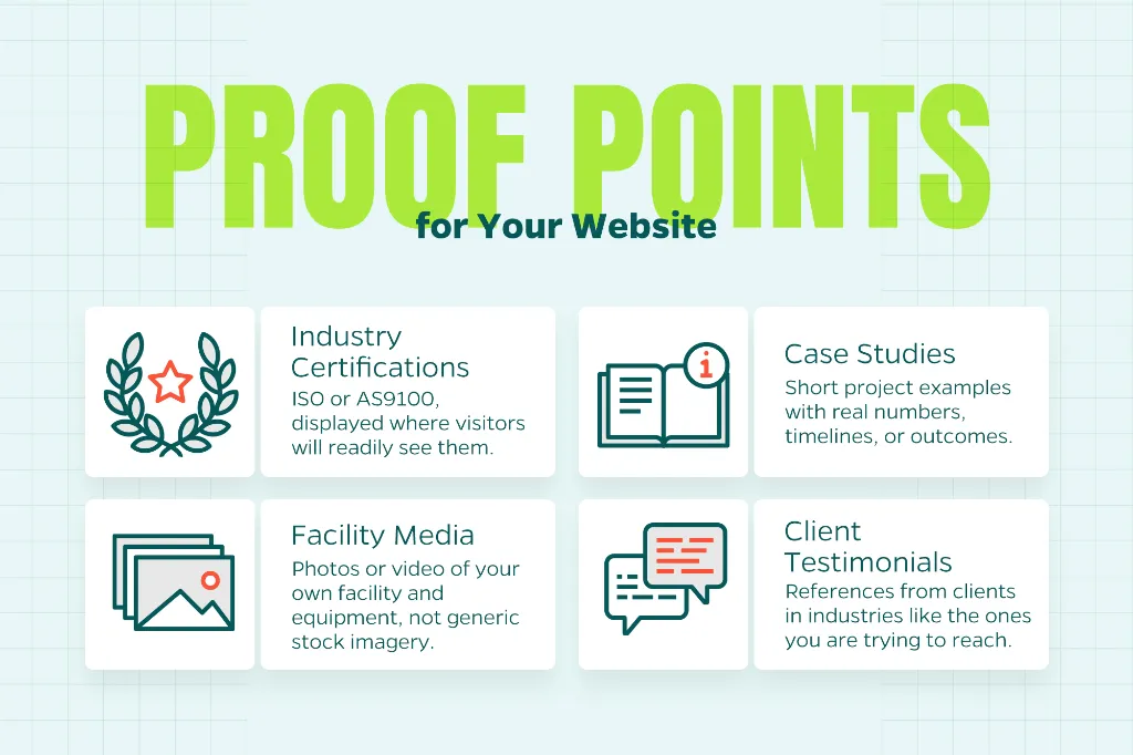
Placement matters as much as the content itself. A certification badge or a strong testimonial tucked away on an “About Us” page will not carry much weight if the buyer never scrolls that far. Put your strongest proof points where decisions get made, such as near a quote request form or at the bottom of a key product page.
Simplify the Path to Contact
A confusing or overly long contact process is one of the fastest ways to lose a ready buyer. If someone has made it through your site and decided they want to talk to your team, do not make them hunt for a phone number or fill out a ten-field form just to ask a question.
Keep your primary calls to action visible on every page, whether that is “Request a Quote,” “Contact Sales,” or “Download Spec Sheet.” Shorter forms tend to convert better, so ask only for what your team truly needs on the first touch and save the rest for a follow-up conversation.
It also helps to set expectations once a form is submitted. A brief confirmation message that explains what happens next, whether that is a callback within one business day or a follow-up email with a formal quote, reassures buyers that their inquiry did not disappear into a void.
Keep Content Fresh and Accurate
Outdated capabilities lists, old equipment photos, or stale case studies can quietly undercut an otherwise solid website. Buyers doing due diligence will notice if your “latest news” section has not been touched in two years, and it can raise doubts about whether the rest of your site reflects your current operations.
Set a regular schedule to review key pages, update project examples, and confirm that every listed capability and certification is still accurate. This same review is a good time to check that contact information, equipment lists, and turnaround times still match what your shop can currently deliver.
Conclusion
Good UX is not about chasing design trends. It is about removing friction so serious buyers can quickly understand what you do, trust that you can deliver, and reach your team without frustration. For small and mid-sized manufacturers competing against larger players with bigger budgets, a clear and well-organized website can be a real differentiator.
Need Help?
Ready to turn your website into a stronger lead-generation tool? Contact Straight North to learn how our team can help manufacturers improve website UX and drive more qualified leads.