


Building a new website or refreshing your current one is about more than aesthetics. A truly effective website drives traffic, converts visitors into customers, and creates experiences that increase sales. At Straight North, we’ve partnered with countless brands to strengthen their digital presence, and we’re sharing the five most critical elements of exceptional website design and user experience (UX).
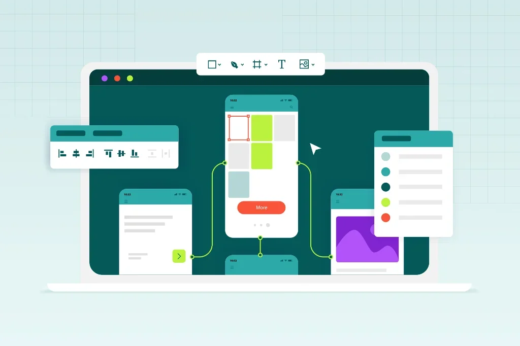
1. Prioritize Mobile-First Design
Imagine a potential customer browsing your site on their phone during a lunch break, only to find text they can’t read and buttons they can’t tap. They’re gone in seconds, and so is your opportunity.
With mobile devices accounting for over 60% of web traffic in 2025, mobile optimization is essential. If your site doesn’t perform flawlessly on smartphones and tablets, you’re losing customers before they even know what you offer.
The mobile-first approach: Design your site for small screens first, then scale up for larger devices. This ensures your mobile experience isn’t an afterthought but a priority. Use responsive layouts that automatically adjust to any screen size, eliminating the need for users to pinch and zoom.
Actionable steps:
- Test your site with Google’s Mobile-Friendly Tool to identify issues
- Aim for load times under 3 seconds by compressing images and minimizing heavy scripts
- Ensure touch targets (buttons, links) are at least 44×44 pixels for easy tapping
- Keep forms short and simple—mobile users won’t fill out 15 fields
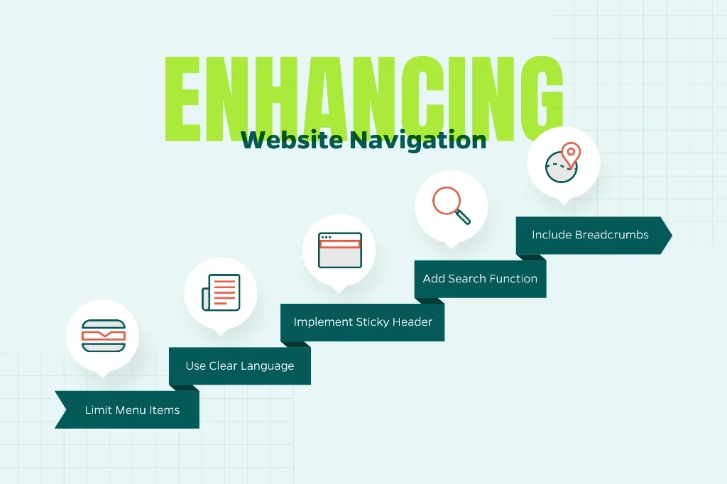
2. Keep Navigation Simple and Intuitive
Have you ever visited a website and struggled to find the information you needed? Maybe the menu was hidden, the labels were confusing, or key pages seemed to be buried three layers deep. Frustrating experiences like these send visitors straight to your competitors.
Effective navigation acts as a guide, helping users find what they need quickly and effortlessly. When navigation fails, so does your website.
Navigation best practices:
- Limit your main menu to 5-7 items to prevent information overload
- Use clear, descriptive language like “Services,” “About Us,” and “Contact” rather than clever but vague terminology
- Implement a sticky header that remains visible as users scroll
- Include a search function for content-heavy sites
- Add breadcrumb navigation to help users understand where they are on your site
The three-click rule: Any important page on your site should be accessible within three clicks from your homepage. This principle keeps your site structure shallow and user-friendly.
Measuring success: Tools like Hotjar and Microsoft Clarity provide heatmaps and session recordings that reveal exactly where users get stuck or confused. Use this data to refine your navigation structure.
3. Focus on Speed and Performance
In our increasingly impatient digital world, speed is everything. Research shows that 53% of mobile users abandon sites that take longer than three seconds to load. Every additional second of load time can decrease conversions by up to 7%. Slow performance isn’t just frustrating—it’s directly impacting your bottom line.
Performance optimization essentials:
- Compress and optimize images using modern formats like WebP, which provides superior compression compared to JPEG or PNG
- Enable browser caching so returning visitors load your site faster
- Minimize HTTP requests by combining files and removing unnecessary plugins
- Choose a reliable, performance-focused hosting provider
- Implement a Content Delivery Network (CDN) to serve content from servers closer to your users
- Minify CSS, JavaScript, and HTML files to reduce file sizes
- Use lazy loading for images and videos below the fold
Set clear targets: Aim for a Google PageSpeed Insights score of 90 or higher on both mobile and desktop. While reaching 100 isn’t always practical, consistently scoring in the 90s indicates excellent performance.
Free tools to get started:
- Google PageSpeed Insights for comprehensive performance analysis
- GTmetrix for detailed speed reports and optimization recommendations
- WebPageTest for advanced testing from multiple locations
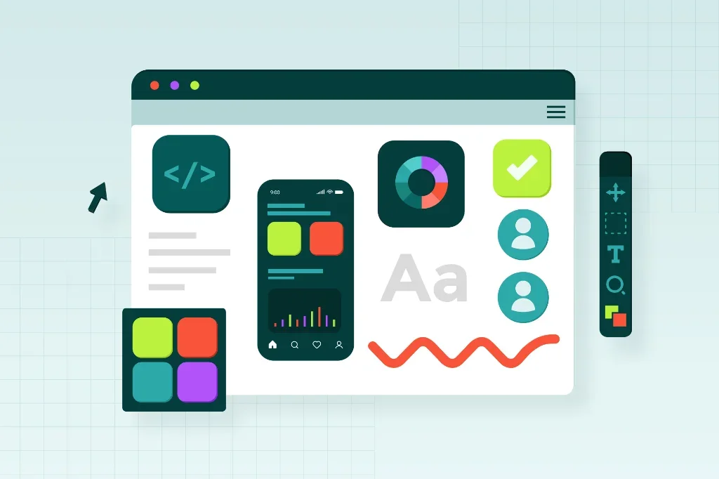
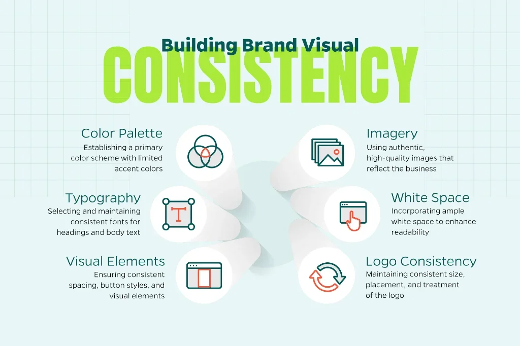
4. Create Visually Appealing, Consistent Branding
Your website should communicate your brand identity the moment someone lands on it. Inconsistent colors, mismatched fonts, or generic stock photography can erode trust before visitors even read your content. Strong visual design is about creating a cohesive, professional experience that reinforces who you are as a brand.
Visual consistency guidelines:
- Establish a color palette with 2-3 primary brand colors, using additional accent colors sparingly
- Select complementary fonts: one for headings and one for body text (and stick with them throughout)
- Maintain consistent spacing, button styles, and visual elements across all pages
- Use high-quality, authentic imagery that reflects your actual business rather than generic stock photos
- Incorporate ample white space to prevent visual clutter and improve readability
- Ensure your logo appears consistently in size, placement, and treatment
Accessibility matters: Design choices should seek to be all-encompassing. Follow these accessibility standards:
- Provide alt text for all images to support screen readers
- Maintain a color contrast ratio of at least 4.5:1 between text and background
- Use font sizes of at least 16px for body text
- Ensure interactive elements are keyboard-navigable
- Avoid relying solely on color to convey important information
Design documentation: Create a style guide using tools like Canva, Figma, or Adobe XD. This document ensures consistency as your site grows and makes collaboration with designers and developers more efficient.
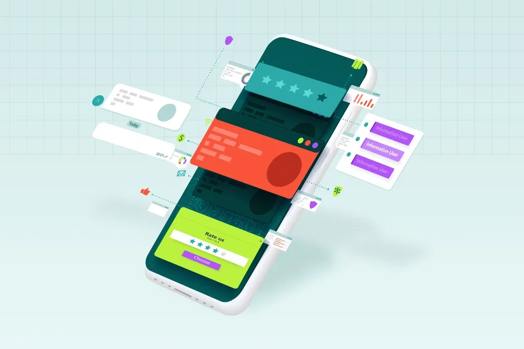
5. Personalize the Experience and Test Continuously
The most successful websites aren’t static—they evolve based on user behavior and data-driven insights. Today’s leading brands treat visitors like individuals, delivering tailored experiences based on how users interact with their site.
Personalization strategies:
- Use Google Analytics 4 to segment audiences by behavior, traffic source, location, and device
- Display relevant content based on user journey stage (new visitors vs. returning customers)
- Implement chatbots or live chat to provide immediate assistance
- Show location-specific information when relevant
- Recommend related products or content based on browsing history
- Use exit-intent popups strategically to retain visitors
The power of A/B testing: Never assume you know what works best. Test different versions of key elements to see what resonates with your audience:
- Headlines and value propositions
- Call-to-action button colors, text, and placement
- Form length and field requirements
- Page layouts and content organization
- Hero images and messaging
Testing tools:
- Google Optimize for A/B testing (or alternatives like VWO and Optimizely)
- Hotjar or Crazy Egg for heatmaps and session recordings
- UserTesting for direct feedback from real users
- Microsoft Clarity for free user behavior analytics
Building Your High-Performance Website
Creating a website is about implementing proven principles that put your users first. Mobile-first design, intuitive navigation, blazing-fast performance, consistent branding, and continuous optimization aren’t merely optional. They are the foundation of a website that attracts visitors, keeps them engaged, and turns them into customers.
At Straight North, we transform these principles into measurable results for businesses across industries. Whether you’re starting from scratch or ready to take your existing site to the next level, Straight North can help create a digital presence that drives real business growth.
Interested in taking your website to the next level? Let’s talk about your goals and create something exceptional together.