

In today’s digital landscape, your website serves as more than just an online presence—it’s often the crucial first touchpoint between your business and potential customers. Mobile devices now account for the majority of all web traffic. That’s why Google has fundamentally shifted how it evaluates and ranks websites. This evolution has brought mobile-first indexing to the forefront of SEO strategy.
Yet, mobile-first indexing doesn’t operate in isolation. To truly capitalize on this shift, your website must be built on a solid foundation of responsive design, ensuring visitors enjoy a flawless experience regardless of whether they’re browsing on a smartphone, tablet, or desktop computer. Let’s dive into what this means for your business and how you can position your website for success.
What Is Mobile-First Indexing?
Google’s primary mission is delivering the most relevant, user-friendly search results possible. For years, Google’s crawlers prioritized desktop versions of websites when indexing content. However, as mobile usage exploded and fundamentally changed how people interact with the web, this desktop-first approach became outdated.
Mobile-first indexing represents a paradigm shift: Google now primarily uses the mobile version of your website’s content for indexing and ranking purposes.
Here’s what this means in practical terms:
- Subpar mobile experience = diminished search visibility: If your mobile site offers less content, reduced functionality, or worse usability than your desktop version, your overall search performance will suffer.
- Mobile excellence = competitive advantage: Websites that deliver exceptional mobile experiences are better positioned to capture higher search rankings and attract more organic traffic.
- It’s not just about having a mobile site: The quality, completeness, and performance of your mobile experience directly impact your SEO success.
The bottom line? In Google’s mobile-first world, your mobile site isn’t secondary—it’s primary.
Why Responsive Design Is Your Secret Weapon
When it comes to thriving under mobile-first indexing, responsive design is essential. Responsive design uses a single, flexible codebase that automatically adapts to any screen size or device.
Here’s why it’s perfectly suited for the mobile-first era:
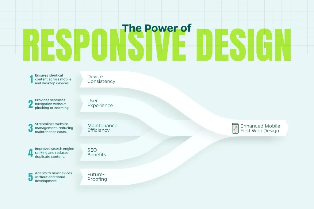
- Perfect consistency across devices: Your content, navigation, links, and site structure remain identical whether viewed on mobile or desktop. This consistency ensures Google indexes and ranks the same comprehensive content across all devices.
- Superior user experience: Visitors never need to pinch, zoom, or struggle with awkward scrolling. Your site intelligently adjusts its layout, images, and functionality to match their device perfectly.
- Streamlined maintenance: Managing one responsive website is significantly more efficient and cost-effective than maintaining separate desktop and mobile versions.
- SEO advantages: Responsive design eliminates common indexing problems, reduces duplicate content risks, and ensures all users access the same high-quality content Google values.
- Future-proof flexibility: As new devices and screen sizes emerge, responsive design automatically adapts without requiring separate development efforts.
The Powerful Connection Between Mobile Experience and SEO Performance
Responsive design delivers benefits that extend far beyond satisfying Google’s technical requirements—it directly impacts how users interact with your site. And in today’s SEO landscape, user experience signals carry substantial weight in search rankings.
Consider these critical connections:
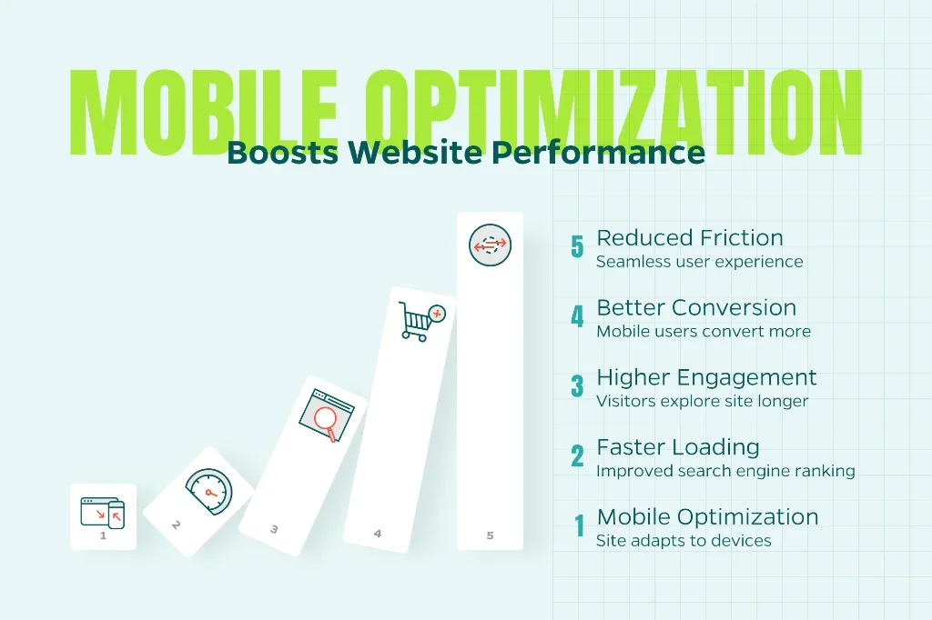
- Page speed optimization: Mobile-optimized sites typically load faster, and Google considers page speed a crucial ranking factor. Faster sites not only rank better but also retain visitors more effectively.
- Enhanced engagement metrics: Clean, responsive design reduces bounce rates and encourages visitors to explore your site longer. These positive engagement signals tell Google your content provides real value.
- Improved conversion rates: Whether visitors are completing contact forms, making purchases, or calling your business, mobile users convert at higher rates when your site functions seamlessly on their devices.
- Reduced friction: Every unnecessary tap, awkward zoom, or confusing navigation element increases the likelihood visitors will abandon your site for a competitor’s more user-friendly alternative.
Here’s a scenario that plays out thousands of times daily: A potential customer searches for your services on their phone, clicks through to your website from Google’s results, but encounters a site that’s difficult to navigate on mobile. What happens next? They hit the back button and click on your competitor’s link instead. This user behavior pattern doesn’t just cost you potential business—it also sends negative signals to Google about your site’s relevance and quality.
Your Mobile-First Optimization Action Plan
Wondering whether your website is ready for mobile-first indexing success? Follow this comprehensive optimization checklist:
- Conduct thorough mobile testing: Use Google’s Mobile-Friendly Test and PageSpeed Insights to evaluate your site’s mobile performance. Don’t just test your homepage—analyze key landing pages, product pages, and conversion-critical pages throughout your site.
- Ensure complete content parity: Verify that your mobile version includes all the essential content, structured data, metadata, and functionality present on your desktop site. Mobile users deserve access to the same comprehensive information.
- Optimize visual elements for mobile: Compress and optimize all images using modern formats like WebP. Ensure videos load properly and don’t negatively impact page speed. Consider implementing lazy loading for improved performance.
- Streamline mobile navigation: Design clear, finger-friendly menus, buttons, and calls-to-action. Ensure clickable elements are appropriately sized and spaced to prevent accidental taps.
- Monitor Core Web Vitals religiously: These user experience metrics—including Largest Contentful Paint (loading), First Input Delay (interactivity), and Cumulative Layout Shift (visual stability)—directly influence both mobile search rankings and user satisfaction.
- Test real-world usability: Beyond automated testing, have actual users navigate your site on various mobile devices. Their feedback often reveals usability issues that technical tests might miss.
- Implement mobile-specific features: Consider adding mobile-friendly features like click-to-call buttons, location-based information, and simplified forms that make sense for on-the-go users.
The Strategic Advantage of Getting Mobile Right
Mobile-first indexing and responsive design have evolved from nice-to-have features to fundamental requirements for digital success. A website that dazzles on desktop but disappoints on mobile faces a double penalty: frustrated users who quickly leave for better alternatives and search engines that deprioritize poor mobile experiences. However, businesses that embrace this mobile-first reality gain significant advantages. By investing in responsive design and optimizing for mobile-first indexing, you’re creating a superior user experience that naturally leads to increased engagement, improved search visibility, and higher conversion rates.
At Straight North, we help businesses build websites that seamlessly blend visual appeal with technical excellence for search engines. Our responsive design solutions ensure your site delivers exceptional experiences across all devices while meeting the demanding requirements of mobile-first indexing. The mobile revolution isn’t coming—it’s here. We’re ready to help you position your website to thrive in this mobile-first world. Contact Straight North to learn more.