Do's and Don’ts for Email Template Design
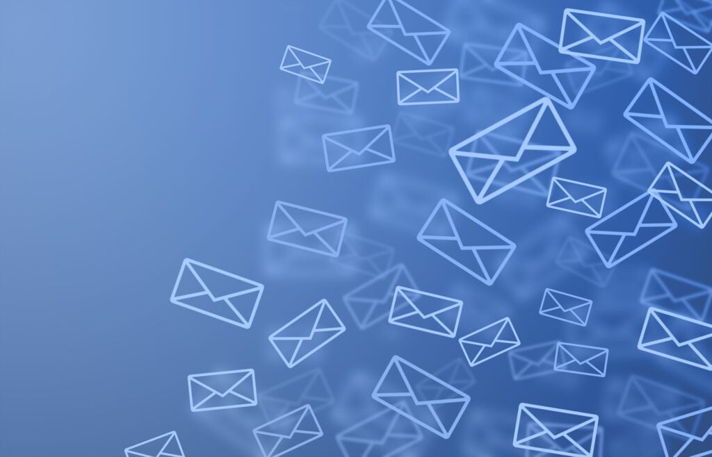
A major player in the realm of digital media, email marketing can an incredibly effective—and cost-efficient—way to reach out to both new and returning customers. The only problem? With the prevalence of spam and junk emails nowadays, it’s easy to get overlooked. Readers scan subject lines quickly, and if your email doesn’t grab their interest right away, they’ll move on.
What can you do?
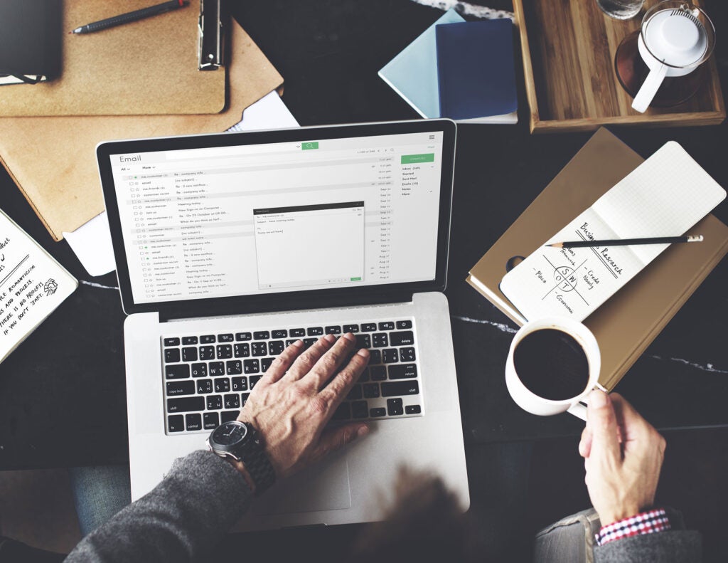
Below, we’ve put together our top 22 tips for email marketing design—time-tested do’s and don’ts for getting your emails read. By utilizing these design tips, you’ll be better equipped to make the most of your email newsletters. What’s more, you’ll see the conversions to prove it.
BIG-PICTURE DESIGN
- DO consider the user. Emails usually come to readers while they’re already in the middle of something else—running errands, at the office, with the kids—so it’s hard for them to give you their full attention.
- DO keep things simple. You may only get a few seconds to communicate your message before a user clicks away from your email, so you want to streamline your design to focus on what’s most important.
- DON’T choose a busy background. Highlight your content by placing it against a solid, simple background of either one color or one very simple, repeating image.
- DO compare your newsletter in various browsers. You never know what browser a reader will be using to view your content, so compare functionality in different versions of Internet Explorer, Firefox, Safari and Chrome.
- DO craft an attention-grabbing subject line. Your email’s subject line will be your first point of contact with readers. According to marketing strategist Fran Iseli-Hall, it “makes a huge difference in the opening rate” and can essentially “make or break a campaign.”
- DO make sure your newsletter comes from a reputable email name. Remember that spam detectors know to filter out e-newsletters from unusual domains.
EFFECTIVE CONTENT
- DO use headlines. Headlines make it easy for users to scan text and pull out key ideas in moments.
- Don’t be overly self-promotional. If readers get the sense that you’re just pushing your promotions, they’ll be easily turned off.
- DO provide valuable info. A good newsletter should provide exactly what it sounds like it would: news. Give readers content that they can appreciate like exclusive offers or relevant info that can help them in some way.
- DO break information into readable chunks. Rather than overwhelming readers with one massive pile of information, break content into chunks that are easy to scan and skim.
- DO focus on tone. The tone of your content goes a long way towards drawing readers and amplifying your brand. Your content should sound like your company, as in, be consistent with your other materials.
- DON’T expect readers to scroll far down. Most readers won’t take the time to scroll far down your email, so you want to emphasize your key info at the top.
- DO give readers a way to opt out. As Matt Nieass writes at Inspired Mag, “Continual unwanted emails will give your company a bad name and could very quickly become an legal issue.”
ATTRACTIVE IMAGES
- DO add captivating images. Amplify the power of your messaging with powerful graphics or photos that make your template attractive and interesting.
- DON’T start with your logo. While of course it’s tempting to promote you business with logos and sales pitches throughout your newsletter, it’s also the surest way to turn off readers. Get your logo in the newsletter, but make value for the reader your focus.
- DON’T rely too heavily on images. Limit the use of images so that your primary messaging is always done through text. Remember that there are many times when images might not load for certain users.
- DO use the alt-text tag. The alt-text tag effectively names your images so if they don’t display, readers see the title instead, giving them an understanding of what would have been there.
- DON’T rely totally on CSS. CSS is known for technical difficulties, so it’s safer to control your design with HTML tables.
CLEAR ORGANIZATION
- DON’T oversize your template. The average email width is 600 pixels, and that’s the size most email template designers recommend.
- DO consider two columns. Organizing your template into two columns of content maximizes the amount of space in which you can feature info.
- DO start with a call to action. As Anita Taylor writes at Lyris.com, “This section of your email might be all that readers see in the ‘reading pane’ or ‘preview pane,’ now a fixture in virtually all email clients.” You don’t want to waste that all-important space with something easy to forget or ignore. Start with your call to action or a clear value proposition, telling the reader why they should click through. Then put your photo or logo beneath.
- DO make that call to action text-based HTML. If your call to action is imbedded within an image or button, there’s a good chance readers won’t see it in the all-too-common situation where graphics don’t load. Make it text-based instead for greater power—then feel free to amplify it with an image.
(Image credit: ©FrameAngel, Fotolia)