In today’s digital landscape, a well-designed site with seamless user experience is essential for driving engagement, conversions, and loyalty. Yet even the most visually stunning websites can fall flat if they’re plagued by common design and UX missteps. At Straight North, we’ve seen countless sites sabotage their own success, and we’re here to help you avoid the same fate. Let’s dive into the top web design and UX mistakes that can cost you customers.
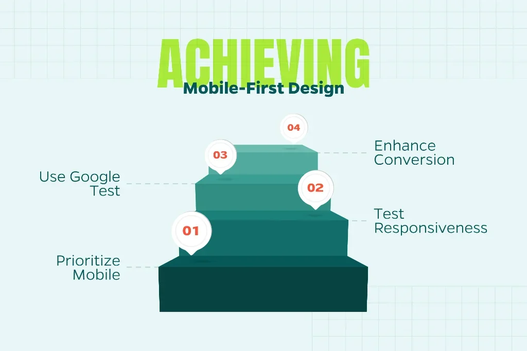
1. Ignoring Mobile Responsiveness
Is your company snoozing on developing a smartphone-friendly site? Wake up and smell the coffee. Over half of global web traffic comes from mobile devices. If your site isn’t optimized for smaller screens, you could be hemorrhaging potential conversions. Non-responsive designs spawn maddening experiences marred by clunky navigation, microscopic text, and buttons that seem designed to dodge your thumb.
How to Avoid It: Make responsive design non-negotiable from day one. Test your site rigorously across various devices and screen sizes to ensure it adapts seamlessly. Google’s Mobile-Friendly Test is your friend here. We recommend adopting a mobile-first approach designed for smartphones before desktops. Your mobile users will thank you, and so will your conversion rates.
2. Overloading with Clutter
Cramming everything onto a single page doesn’t make users more informed; it makes them bounce. When users encounter a site that inundates them with excessive pop-ups, aggressive banners, and mountains of text, they flee from the monstrosity of visual chaos.
How to Avoid It: Channel your inner minimalist. Embrace white space as a design feature, not wasted real estate. Use a clear visual hierarchy to guide users’ eyes to what matters most. Highlight key calls-to-action (CTAs) and ruthlessly evaluate every element with this question: Does this add genuine value, or is it just noise? If you can’t defend it, cut it.
3. Neglecting Page Load Speed
Want to lose 40% of your visitors? Just make them wait more than three seconds for your page to load. That’s what research tells us about user patience (or lack thereof) in the digital age. Slow load times don’t just frustrate users; they torpedo your search engine rankings and signal to Google that your site isn’t worth recommending.
How to Avoid It: Speed optimization should be a priority, not an afterthought. Compress images without sacrificing quality, leverage browser caching, and minimize JavaScript bloat. Run your site through Google PageSpeed Insights to identify bottlenecks. Remember: every millisecond counts. A fast site keeps users engaged and gives your SEO a healthy boost.
4. Complicated Navigation
It’s a problem when users need a treasure map to discover how to contact you. Overly complex menus, vague labels, and buried navigation options create friction at every turn. Frustrated users won’t stick around to figure it out. They’ll bounce. And they won’t come back.
How to Avoid It: Your navigation should be so intuitive that users don’t even think about it. Use clear, descriptive menu labels that say exactly what they mean. Limit your main navigation to 5-7 items max. For content-heavy sites, add a robust search function. Most importantly, test your navigation with actual users—not just your team who already knows where everything is.
5. Skipping User Testing
Designing based on what you think users want is like throwing darts blindfolded. You might hit the target occasionally, but you’re mostly relying on luck. Without real user feedback, you’ll miss critical pain points and usability issues that could tank your site’s effectiveness.
How to Avoid It: Make user testing a standard part of your process, not a luxury for when you have extra time. Conduct tests at multiple stages—wireframes, prototypes, and post-launch. Use surveys, heatmaps, and A/B testing to understand how real people interact with your site. Let data, not assumptions, guide your design decisions. Your users will tell you exactly what they need if you give them the chance.
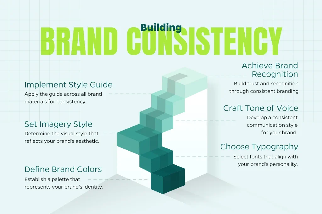
6. Inconsistent Branding
Imagine walking into a store where every aisle looks like it belongs to a different business with different colors, different fonts, and different vibes. That’s exactly what happens when your website lacks brand consistency. Mismatched fonts, clashing colors, and tonal whiplash erode trust and make your business seem scattered or unprofessional.
How to Avoid It: Create a comprehensive style guide that nails down your brand’s colors, typography, imagery style, and tone of voice. Then actually use it. Every page, every element, every word should feel like it comes from the same cohesive brand. From your homepage hero to your footer CTAs, consistency builds recognition and trust.
7. Forgetting Accessibility
Ignoring accessibility standards like WCAG doesn’t just exclude users with disabilities; it limits your potential audience and can even expose your business to legal action.
How to Avoid It: Bake accessibility into your design from the start, not as an afterthought. Add descriptive alt text to images, ensure keyboard navigation works smoothly, and use high-contrast color schemes for readability. Tools like WAVE or axe can help you catch and fix accessibility issues before launch.
8. Weak or Missing CTAs
Your website exists for a reason: to drive action. Whether that’s making a purchase, booking a consultation, or downloading a resource, every page should guide users toward a clear next step. Vague, hidden, or nonexistent calls-to-action (CTAs) leave visitors wondering “Now what?” and ultimately converting nowhere.
How to Avoid It: Make your CTAs impossible to miss and misunderstand. Use action-oriented, benefit-driven language like “Get Your Free Quote” or “Start Growing Today” instead of generic phrases like “Submit” or “Click Here.” Place CTAs prominently on every page. Make them above the fold and at natural decision points throughout your content. Test different colors, sizes, and copy to find what resonates best with your audience.
Building Websites That Actually Work
Avoiding these common mistakes isn’t about rote rule following. It’s about respecting your users’ time, meeting them where they are, and making it easy for them to do business with you. A website that prioritizes user experience and thoughtful design doesn’t just look better; it performs better, converts better, and ultimately drives real business results.
At Straight North, we specialize in creating websites that strike the perfect balance between stunning aesthetics, rock-solid functionality, and user satisfaction. Ready to build a site that not only attracts visitors but turns them into customers? Let’s talk about creating a digital presence that moves the needle for your business.