Landing pages are a valuable tool for forming relationships. Whether the viewer is arriving via email link, advert, or QR Code, he or she has already taken the most important step -- initiating a conversation. That means your landing page viewer no longer a cold lead. Congratulations, he or she is already somewhat prequalified and interested in your brand.
Do not let this amazing opportunity pass you by! Make sure you welcome your new interested viewer with a top-notch and user-friendly landing page design.
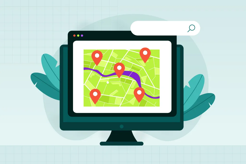
This post focuses on one specific type of landing page. Viewers who arrive at your landing page via QR Codes have very specific needs since we are absolutely guaranteed that they are viewing your page on a mobile device. Therefore, certain specific design elements need to be taken into consideration when designing a QR Code landing page. Here are some to consider:
Use a Clear and Concise Call to Action
Tell visitors exactly what you want them to do. And, tell them exactly what they will get in return. If visitors to your site via a mobile device don’t experience instant gratification, don’t lead them to believe they will or they will be gone in a flash.
Consider Using Video
Using videos on a QR Code landing page is a great idea and the perfect way to share information quickly and easily. Videos also have the potential to share information that can’t be experienced any other way. For example, a real estate agent could use a QR Code on a yard sign and direct visitors to a virtual tour of the property on YouTube.
Videos are especially helpful for people on the go. For example, visitors might scan a QR Code on a business’s “closed” sign as they head to their car. While fumbling for their keys, unlocking the door, and getting belted in, they won’t be able to read the landing page’s information. They could, however, listen to the video and occasionally glance at what is happening on the screen. Something is better than nothing, right?!
Use Typography to Your Advantage
All too often, typography is disregarded in website design. In the grand scheme of things, it is easy to dub typography as too time-consuming and move on. While that may be true, typography is still important, especially for landing pages viewed on small mobile device displays.
Use typography to create a clear hierarchy of information. That way, the eye can quickly pick out the important elements on the page, and viewers can easily detect where they should start reading and where they should go next.
Be Careful with Color
Just like typography, color significantly impacts a user’s experience on your site. Be mindful of color contrast. Positive images – black on white – are easier to read than negative images – white on black. This is especially true for small fonts viewed on mobile devices.
If you can do it without compromising legibility, consider using color to separate sections of information. This is another way to create a hierarchy.
Are you using your landing page to drive traffic to your social media accounts? By now, most people associate the simple F logo with Facebook and the T logo with Twitter. However, a viewer’s ability to recognize the logos decreases if the logo color is altered in some way. While an all white Facebook logo may be more compatible with your design scheme, stick with the original.
Be Supportive, Not Overpowering
A landing page can have both a call to action (CTA) and supporting information. In fact, viewers appreciate knowing who you are and what you do as soon as possible, so be sure to include at least a brief introduction on your landing page. Just be sure this information doesn’t deter viewers from continuing to the sign-up process. If your visitors are confused about what you want them to do, they’re likely to make a quick exit.
Let Viewers Know the Deal Breakers
When you include a sign-up form on your landing page, make sure you clearly mark the mandatory fields. Let viewers know what they must enter and what is optional. Confirm that it isn’t a deal breaker if they don’t want to include specific information.
Consider the Content
No one likes self-serving copy. Don’t make your landing page all about you; make it all about them. Tell viewers how they will benefit from your company’s products or services.
Include Multiple Sign-up Buttons
Make sure your call to action is always just a tap away. If you have a long landing page, place a sign-up button at the top and bottom. If viewers read all the way to the bottom, they still have a button to tap. If they don’t read everything you have to say, the CTA button is front and center.
Consider placing helpful links near the second sign-up button at the bottom of the page. If viewers scroll all the way down, they probably are a bit hesitant about your company or what you want them to do. Give viewers some reassurance. For example, place a “learn more” link and a “see a demo” link beside the call to action.
Give Bonus Information
Consider adding some genuine and friendly testimonials next to the sign-up button. This just might be the encouragement the viewer needs to make a decision.
Examples are another great selling feature. If you are designing for a weight loss company, include some before and after pictures. If your client is a photographer, share some shots from a recent family portrait session.
Choose Your Battles
Do you want visitors’ email addresses or their Facebook likes? Don’t let your social media engagement distract from the sign-up process – and vice versa.
Think About the User
Mobile devices have come a long way, but they still have their limitations when compared to displays on a desktop or laptop. When you design a mobile-friendly landing page, consider the following:
- Location matters. Where will the QR Code be printed? On a restaurant table tent? On an airport sign? At the subway station? If people are on the move, they won’t have time to stop and complete a lengthy registration form. Consider providing a link via email to download the content later. Or add a simple Facebook like button to that particular QR Code. Use a registration form on a QR Code in a different location.
- Above the scroll. Check your landing page display on the most popular smartphones. Where does your page or form cut off? Make sure the most important information and form fields are above the scroll.
- Minimize load time. Remember that all viewers are using a cellular network or Wi-Fi connection. If downloading your landing page takes too long, people will make a quick exit.
- Limited finger dexterity. Since the invention of smartphones, people have significantly increased their finger dexterity. However, there is still plenty of room for error. Don’t make your visitors enter a ton of information. Use checkboxes and drop-down lists whenever possible. Avoid lists of hyperlinks; stacking one link on top of another makes it too easy to tap the wrong one. According to the Apple iOS develop site, tappable areas should be 44 x 44 points (a point is 1/72 of an inch).
- Scrolling. If scrolling is unavoidable, go down instead of sideways.
Take a look at your current landing pages. Evaluate the usability of each one, taking into consideration the ease of use for mobile devices. Your QR Code landing page needs to be just as user friendly as any other webpage.
About the Author
Jarrod Wright, the Owner of Subtle Network Design & Marketing, offers Search Engine Marketing and Creative Design Services to a wide variety of clients including Trim Nutrition. You can follow him on Twitter.