How would you like to spend less money building your new website than you spent on the last one?
You can do exactly that without sacrificing quality. And not only can you build it cheaper, you can build it better, getting a site that generates far more leads than the one you have now.
Too good to be true? Not at all. The simple key — and the one few companies want to use — is REDUCE.
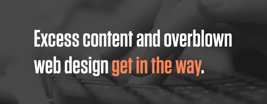
Excess content and overblown web design get in the way.
- Volumes of content keep prospects from finding the information they need and from inquiring.
- Offbeat or complicated designs slow page loading, and make it difficult for prospects to move around the site, find what they need and convert.
All of the excess puts barriers between you and a prospect phoning in or submitting a form. But excess website weight is as easy to gain as excess weight around your middle if you habitually overeat.
- Departments continually lobby for more mentions of their accomplishments and major projects.
- Product managers can’t resist writing about every product/service feature under the sun.
- Creative marketers love piling on infographics, interactive user tools and dazzling slide presentations.
- Designers can’t wait to work the latest design fad into the website.
- Companies feel compelled to talk about themselves at length wherever they see white space.
Even a site that starts out simple and straightforward ends up being a ball of confusion — and useless in terms of lead generation — a year or two down the road.
Reduce!
Advertising legend David Ogilvy said, “If it doesn’t sell, it isn’t creative.” You’ll never find better advice for building a website.
- Do your cool design features capture conversions? If not, dump them.
- Do your mountains of content reel in conversions? If not, cut them down to size.
Simple sells. Remember: Your prospects are busy dealing with their own business problems, so the only things they want to know about your company are these:
- Do you have what I need? / How can you help me?
- Are you a legitimate company?
- How can I find out more?
- Why should I take action now?
Prospects don’t want to spend 15 minutes on your site trying to figure these things out, let alone sifting through content on unrelated topics.
So the question is, how can you answer these questions in the fastest, simplest way possible?
- Can you convey the value proposition in a couple of sentences instead of a 300-word intro to each product page?
- Can you use one or two compact testimonials to convey product benefits rather than 500 words of your own marketing propaganda?
- Can you convey legitimacy by displaying logos of your well-known customers instead of a 1,000-word “About Us” page?
- Can you reduce your inquiry form fields from 10 to two?
- Can you create a powerful, 10-word reason for prospects to inquire today instead of a month from today?
- Can you eliminate the 100 pages of your website that don’t affect conversions, or even detract from conversions?
Think like a prospect to achieve simplicity in your new website.
- Prospects are overwhelmed when they see big chunks of copy. Their first thought: “I’ve got to get off this site.”
- Reams of copy may suggest desperation to a prospect rather than competence.
- White space suggests efficiency and authority to a prospect. Cluttered design suggests the opposite.
- Simple and straightforward tells prospects you respect their time and understand their needs. Many prospects will see this and think, "I’m sold!"
Ready to start selling with your website instead of just drifting? Contact us now to discuss your upcoming web development project.